Day 37 – Autism, illness, love and faith.

Being unwell has some odd effects on me.  I’ve been told that some of this is probably due to the autism, some is just the way my particular body and mind work and some is common to most people.

I’m normally a calm and quite happy person and well able to keep my head in difficult, even threatening, circumstances.  This is why I did well working with children who had emotional and behaviour problems when I first qualified as a teacher.  However when I get sick I become less able to manage as well as I normally do emotionally.  This tends to come out in the evenings when I’m tired.  I find myself getting tearful for reasons I can’t understand.  Because of the autism, I sometimes don’t notice other symptoms for a long while so the first sign on me getting ill is my emotions.  Then when I take my temperature and check myself over I find I’m feverish and unwell.

Once I realise what’s going on and start to take care of the illness I get medical help and proper bed-rest.  Then although I still feel horrible physically, emotionally I begin to feel better.  As soon as the fever begins to break I start to sleep a lot.  After a few days of that, when the illness goes, even though in this case I’m still left with a cough, it’s like waking up on a sunny morning after a night of heavy rain – everything is fresh and clean and quiet in my mind and I feel closer to God than usual.

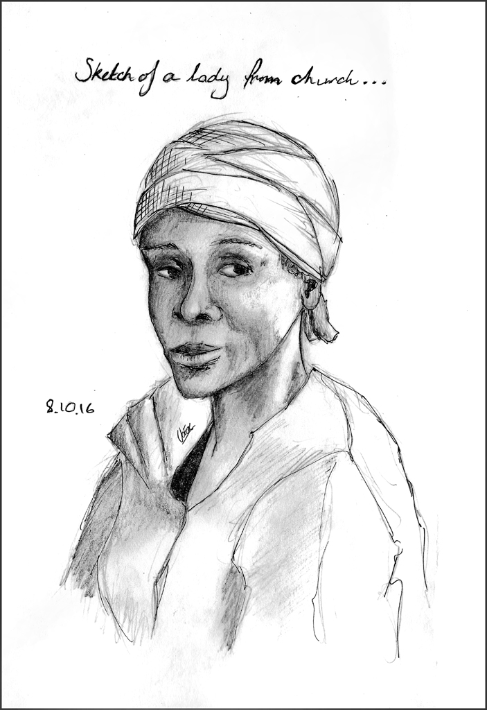
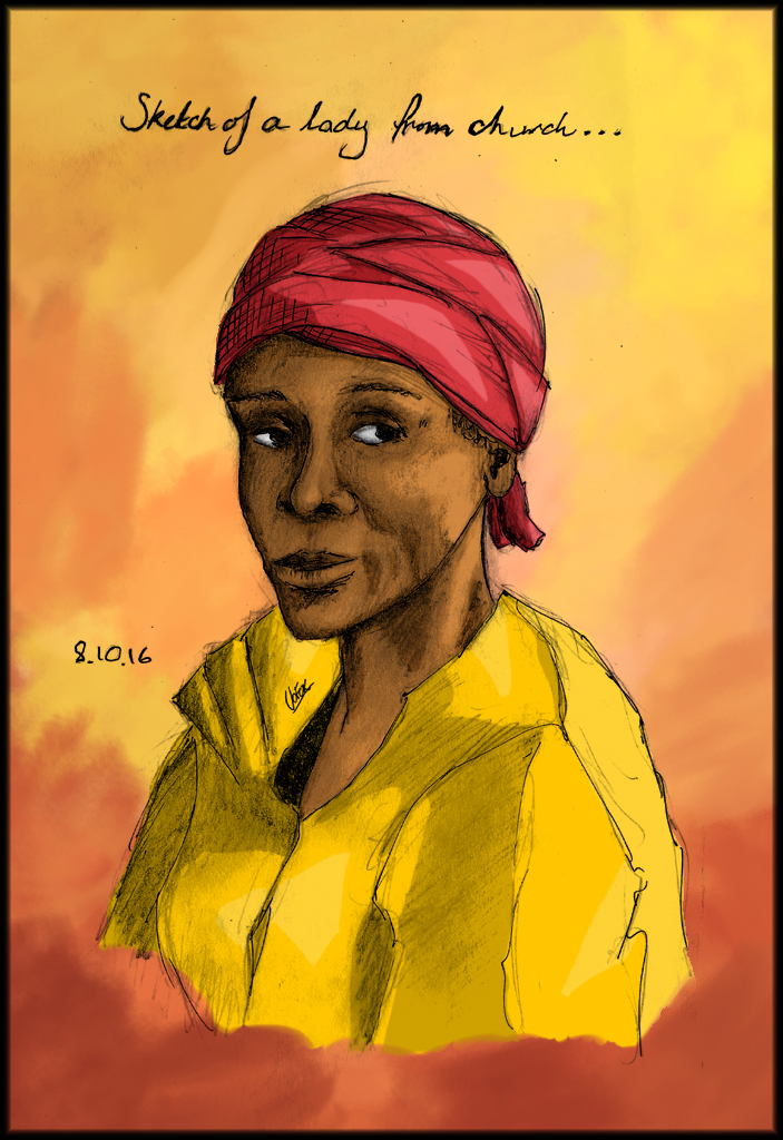
It was in this state of mind that I drew the following in my sketchbook…

my-saviourscan_web


The symbol on the left is from a Catholic group called the Jesus Caritas Fraternity, although it is my own design of their idea.  I’m not Catholic myself (I’m Baptist) but I have a dear friend of many years, another teacher, who is.  She’s a musician too and we’ve played in catholic and protestant churches all over our home town.  Anyway the Caritas people concentrate on bringing the love of God to people who are abandoned and marginalised in a quiet, lowly way.  They don’t push conversion, instead they love people and care for them unconditionally believing that when people feel the love of God for themselves, then conversion becomes natural.  This is how it was for me.  Having read some books related to all of this by a chap called Carlo Caretto I came to see this symbol as meaning the love of God in Jesus and it became really very personal for me.

Many years later I ended up getting a tattoo of this symbol with the Japanese character Dao 道, which means road, path, way.  The design I did for this was…

jesus-caritas_way_tattoo-copy

It’s on my foot as a reminder to always walk in the path of the love of God – like a prayer which is always with me.  🙂

Anyway the picture on the right, of the shepherd and sheep kind of expresses a bit, that feeling I was trying to convey when I previously tried to draw some more religious art a month of so ago and ended up giving up.  It shows, for me I think, the love and safety and wholeness I feel so much from my faith.  (The shepherd is supposed to be Jesus and I’m the sheep.)

Here’s the final image…

my-saviourfin_web

Days 32 to 34 – Sketchbooks and portraits

Since I started drawing regularly on a small sketchbook which is more the size of a notebook (13cm x 21cm) I’ve found it much easier to draw than before.
My Notebook


I don’t really know why.  In my big sketchbook (I have an A3 and an A4 so they’re not really that big) I worry about wasting paper and I get the feeling that everything has got to be good.  Both of these things make it more difficult to draw freely which is what I’m trying to do.  In my new little notebook style sketchbook it’s so much better.  I can always find something I want to draw and I’m much more able to take risks and try new things.

In this portrait I was really aiming for a loose feel to the linework and to just get a feel for my subject visually.  This is a lady who sometimes comes to our church and has a remarkable face.  She looks so calm and regal and I really want to make a painting of her one day.  She has given me permission, but I’m still at the sketching stage.

Here’s the sketch – it’s done in pencil with some fineline ink outlines.

lady-from-church_fin_web

Once I’d scanned my drawing into the PC I also had a go at adding some colour using the cell shading technique I used before.


lady-from-church-fin_web-col


PS:  Apologies about the handwriting on the top of this portrait.  I still have this blooming chest infection so I’m taking a lot of Ventolin which gives me hands the shakes.  I can manage to draw with some difficulty when this happens but my handwriting is terrible.

Days 29 to 31 – Animal Managery

I sketched out some animals in my notebook and used their shapes to kind of fit close together (ish).  Here is my line work:

animals-ink-fin-web

Then I shaded them with pencil..

animal-managery-2_web


I really liked this effect – with an ink outline and the shading in pencil.

For ages now I’ve been looking for a way to illustrate in a comic style which I like and am happy with.  I’ve been playing around with different styles for years now.  However,   I just spent a few hours colouring the above  ‘Animal Managery’ drawing .  I did this in Photoshop and used a cell shading style with a mid, light and dark version of each local colour.  I did it straight over the top of the pencil and ink drawing – setting the drawing layer to multiply.

Here’s the result…

animal-managery-col-flat_fin

I think I’ve stumbled onto a style which I finally really like.  I’m going to follow up on this!  🙂


Days 27 and 28 – Pokemon, Turtles and an Apology

To keep up with sketching everyday I’ve decided to use a smaller notebook as I can more easily carry it around and that gives me more time for drawing.

So here’s my notebook pages for the last two days..


turtle-and-pokemon_fin-web


Pokemon

I started of with some lovely Pokemon to get warmed up, and because I like them – all credit for their creation to the wonderful Tajiri San.  You can see that the grey shading pens I was using do not give a very even result – they’re really patchy which is not what I want.  I guess I need to get some alcohol based markers.  They’re supposed to be much better.


Turtle

Then today I drew a patterned ink turtle.  I began with several photo references  so I could get the turtle shape right.  Then I just let my doodling hands do their thing…which was fun!  Here are the final inks…


turtle-orig-inks_fin_web


You can see that my line work is quite shaky in this drawing – mainly because as my breathing got worse I took more Ventolin which gives me a tremor.  I can work around it by working fast but when I needed to draw slower smaller lines it showed up.

Generally, I quite like this picture plain like this but, once I had the image scanned in, I couldn’t help adding a little shading.  Then one thing led to another and I ended up using just a dash of colour to give it a little punch.  He’s my completed image…


turtle-fin_web


Apology

Apologies for not posting for a while.  My chest infection got a lot worse and , even though these drawings were done about ten days ago, I didn’t want to post things without knowing I’ll be up and around to answer comments.  Anyway, after 4 days in bed and a third course of antibiotics I feel like I’m on the mend – at least enough to answer comments!  The next three posts after this were all done before my health got worse too.  I’m going to allow them to be published every couple of days now I’m getting better.  (It’ll stop me getting ‘stir crazy’ in my home for all this time!)

Days 25 and 26 – a dinosaur egg

I wanted to make a simple picture of a dinosaur breaking free from an egg.  Here’s the ink sketch…

egg2lineartweb

Now what I’d really like to do is to colour it with copic markers.  I think that way of colouring would work brilliantly for this subject.  But copics are just ridiculously expensive  – I just can’t ever imagine having the kind of money that would allow me to spend that much on a set of markers.  They must be making a killing from selling those things.    So, I have to find another way.

I tried to colour the picture with gouache…

egggouachefin_web

It was OK but it’ll take some good hard practice to get it looking good.

I also had a go at colouring really quickly using digital tools in Manga Studio.  I was cooking dinner at the time and only had a five minute window before I had to get back into the kitchen.  Here’s the result of that escapade…

egg2colour-planningfin_web

It’s kind of rough but it turned out much nearer to what I’d originally wanted than the gouche.  I think because I was only investing 5 minutes into this job I was kind of free to just slap on the colour and not worry about it.  Perhaps I will try to do that with gouach?


Days 17 and 18 – A winged woman

Today I played around a bit more with my new graphgear mechanical pencil.

graphgear1000

I drew a sketch of a woman with wings.  She started off as an angel and then became a fairy.  Then I put a dress on her, which, if you’re flying up in the air, isn’t exactly practical!  Anyway, I was trying see if I could follow Mark Crilly’s drawing style for his Miki Falls manga / comic book series.

Here’s an example of his art on this project:

mikk-falls-art-example

I like the way he has thicker, darker lines around the main objects and then shades the rest like a really good pencil drawing.  You can really see what I’m mean if you look at Miki waking up in her sleeping bag in the bottom left panel.

So here’s my attempt at that kind of style / effect:

018-pencil-angelfinweb2


I used a black coloured pencil to do the thick outlines.  It was a watercolour pencil so it was really soft to use and I think I ended up making the lines too thick.  Nevertheless, I’m beginning to get there with that kind of style.


(Then just because I had the watercolour pencils out I decided to colour my picture…

I don’t like the watercolour pencil effect much.  I should have left it alone!

Days 15 and 16 – Shades of a Grey Wolf

Some of my new art supplies arrived today.  I bought another set of the Faber-Castell pens in shades of grey.

grey-pens

I also got a Pentel Graphgear 1000 in 0.5, which is a mechanical pencil.  I’ve never used one before but I wanted to see what it was like and whether I would take to it or not.

It looks like this:

graphgear1000

Well, I can hardly stop myself drawing when I don’t have new supplies to try out, let alone after these arrived!

So first I had a go at sketching a werewolf.  For reference I used this art book by Glen Fabry:

anatomyforfantasy

I changed the posed a bit and the way I drew the paws.  Here’s the sketch:

016-wolf-sketch

I found the graphgear pencil really easy to use.  I could get a good range of strokes with it and the linework stayed very consistent.

Then I inked the sketch.  I was used a normal liner pen for this which doesn’t have the facility to make strokes of different widths so to make that effect I had to thicken and even colour-in my line work at times.  Here are the inks:

016-wolf-ink


Then I added some grey tones with the Faber Castell pens.  I’ve had a set of these before and I  like the way they work.  However my current artist’s notepad is only 170gsm and I’ve found that this is not enough to hold much in the way of ink.  So I used the pens quite sparingly and it turned out OK I think.  I might do another picture at a later date on bristol board and see if that’s better for layered ink.

Here’s the final picture:

016-wolf-fin

Challenge Days 11 and 12 – The Nakasendo Way

Over the last week I’ve been unwell with a chest infection.  I was still able to sketch a bit after a few days but haven’t been well enough to do much more.  Fortunately I had my last post already scheduled before I became ill so that went ahead without me.

While I was unwell in bed I was looking through pictures of Japan on my tablet.  I came across this old route from Kyoto to Tokyo called the Nakasendo Way.  It’s a route which people often choose to walk as it is recognised as being quite beautiful.

As I was recovering I began to try to sketch a scene from a small town on the route.

kiso_road_matsushiroya

It was difficult because as the road climbs and turns it puts buildings into perpectives with different vanishing points.  The first thing I did was to slightly simplify this to two points.  I wasn’t aiming to sketch an exact copy but to make an enjoyable scene.

Here’s the beginning of the drawing construction:

d10-contruction-lines

I was drawing very lightly, mainly because I was in bed and not sitting at a table I think, so I had to ‘push’ the photograph when I got it into my PC to get it to show the lines.  Here’s the finished sketch:


d10-street-sketch


My next stage, when I was well again, was to ink the sketch.  It was quite a therapeutic thing to do – really relaxing.  I love inking!

Here’s my finished ink drawing:

d10-ink-street-_fin_web

As you can see, instead of putting in the people who were in the original photograph I put in someone in more traditional dress.  I also added (at the sketching stage) a plant pot on the bottom right to add interest and detail to the forground.   I’m sad to say that I don’t read Japanese  and so I have no idea what the sign at the front of the picture says or if I copied it accurately enough.

Once that was done  I scanned the images into my PC and then added some greyscale shading to the picture to finish it off.  Rather than making all the ‘flats’ (areas of single colour which can be used to define a mask and paint just that bit), I decided to paint the greycale shading on – just colouring it in like you would on a paper colouring book.  It was much quicker.  In a couple of places I later played around with the lightness of certain areas using a mask.  Generally though I think I prefer the more organic shading as I think it has a nicer feel.  I tried to keep the shading simple and to use it to bring out the main shapes in the little town landscape.

Here’s my finished picture:

d10-ink-street-greyscale_fin_web

I’m really pleased with this one.  🙂


Challenge Days 9 and 10 – “Regret”

This weekend I re-read the Comic book related to Philip K Dick’s brilliant “Do Androids Dream of Electric Sheep”

do-androids-dream-philip-k-dick


It’s done under the same title as Dick’s original novel but it’s a new story in the same world wirtten by Chris Roberson.  I thought it was really beautifully done.  The artwork gave tremendous atmosphere to the story and really fitted well with the subject matter.  The actual story art was done by Robert Adler (with colours by Lozano and Suppa).  He employed a loose rough feel in the inks which, together with sensitive cell shading styled colour worked wonderfully.  Often with looser, rougher ink work I find that the picture gets confused but the cell shaded colour made it all really clear.  Here are some examples of the work from the first issue:

do-androids-dream-of-electric-sheep-image1


do-androids-dream-of-electric-sheep-image2


do-androids-dream-of-electric-sheep-image3


I thought it would be wonderful to give this style a try in a couple of ways.  First I wanted to try this style but using rough pencils rather that rough inks.  Then I’m going to have a go at trying to ink in my own version of Adler’s approach.

So, to try this approach with pencils…

Here’s my initial pencil sketch:

jail-cell-pencils

Then here’s a pencil version with my ideas of how to light the image scribbled in…

jail-cell-sketch


First I just scanned it in a then put in some greyscale shading…

jail-cell-greyscale


Then I coloured it fully and, to finish off, highlighted it…

jail-cell-fin_web


I’m going to call the picture ‘Regret’  because the chap in jail might be feeling sad for whatever he did to get him locked up.

So, reviewing this,  I think I like the lighting and the colour scheme but I’m less fond of the rough pencils used as the final lineart.  I think pencil could work and would give a nice texture  to the lines but it has to be tidy and not just a rough sketch.  That said it was great fun to do!    🙂