In my watercolour book I came to a page which explained that it can be helpful to make some ‘tonal’ sketches before doing a painting. This means looking at:
- The overall lightness or darkness of the picture. (This is called the picture’s ‘key’. A ‘high key’ picture is a bright scene; a ‘low key’ picture is a darker scene overall.)
- The tonal values within the key of the picture – how dark or light each part of the picture is compared to the rest of it.
- How the different tones balance in the composition.
- How many values you’re going to use. The author of the book suggests starting with 5 and then moving on to 9 when you get better.
He explained how you have to look at your scene and then assign each actual value (which can have millions and millions of gradations in nature) to one of the five values you’ve decided to use. I’ve never done this, or even thought about it this way, so I decided to have a go at making a sketch like this.
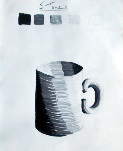
I began by trying the tonal exercise with a simple image of a mug:
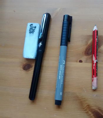
I used – a black brush pen, a dark grey manga pen, a pencil shaded moderately hard and shaded lightly and the white of the paper (sometimes emphasied with the use of my eraser.)
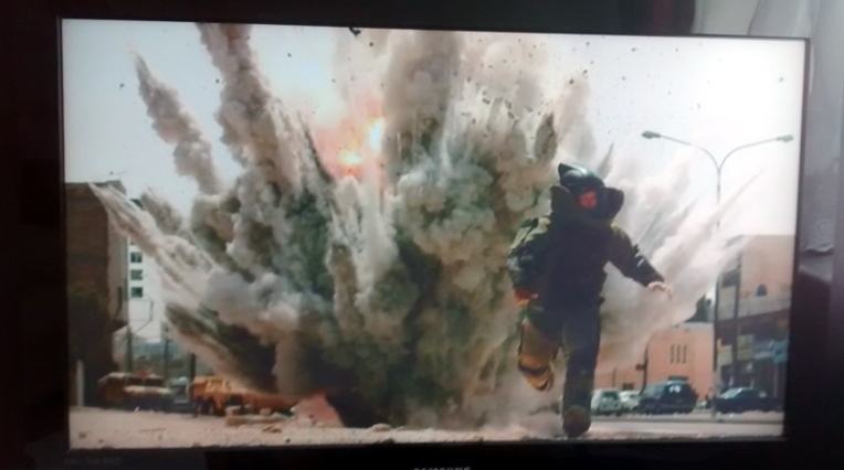
However, later that afternoon I was watching a film while catching up with the ironing. It was called ‘The Hurt Locker’ and was about a bomb squad team in Iraq where the chap who actually defuses the bombs is kind of addicted to the dangerous bits. There was scene in the film, quite near the beginning, when one of our bomb disposal heroes (not the addicted chap) is caught in a blast. The brave man dies. The cinematographer showed this in slow motion and although it was awful and shocking and sad, it was an incredibly powerful image as well. I couldn’t get it out of my head.
As near as I can photograph it (I couldn’t control the playback very accurately on my TV equipment) this is the scene:
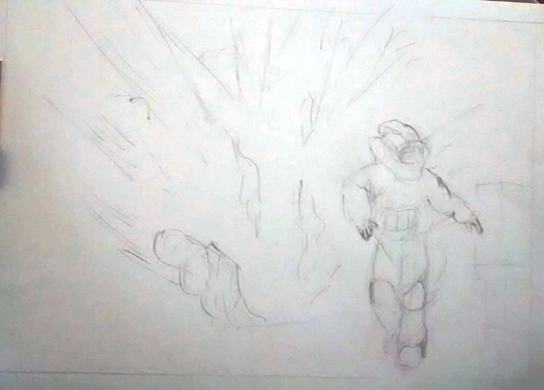
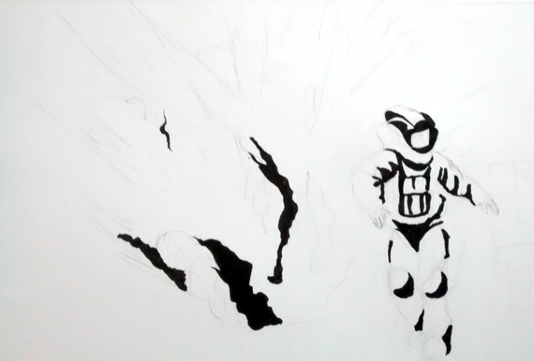
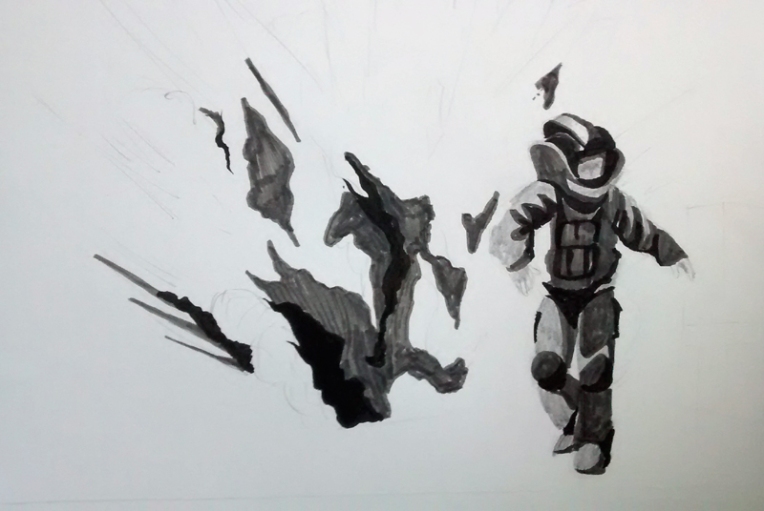
So I had a go at drawing it as a tonal sketch too:
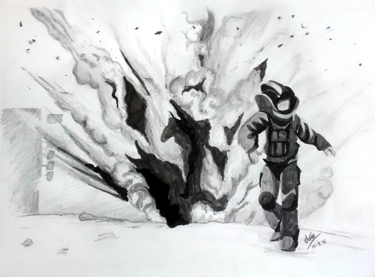
So here’s the finished study:
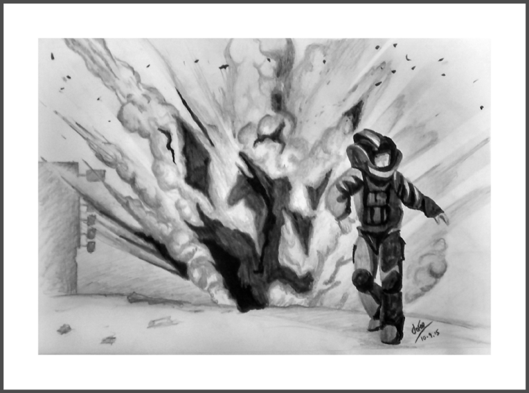
Then I went on to really complete the drawing to a point where I was happier with it. This did involve using more than my original 5 tones:
My respects and warmest wishes to the brave men and women (and their families), all of the world, who disarm and dispose of these awful weapons.

Thanks for your comment! The picture I used for reference wasn’t quite the one I managed to phtograph – so the legs were different. The bit I painted was where he’s just getting hit and his forward momentum stops. Thinking about what you say though – if I could have got my Tivo to stop at the right point I think the image I eventually photographed would have been better – movement-wise. Thanks again!
LikeLiked by 1 person
In uni drawing, thrn later in painting we had to do tonal works using a still life with a light source. We didn’t have the benefit of using different media. In the drawing it was just black charcoal and white paper and with oil paint it was just raw umber and titanium white with liquin as a thinning agent. Very challenging. The other thing was that we were not allowed to make line drawings but had to reprint the objects purely by distinguishing tonal value. You can see the results on my blog if you wish to. With your painting of the bomb blast and man; I think you did a good job with the tonal values. But can I make a suggestion with regard to movement in the painting. Observe the variation between the photo and the painting in the man’s legs and foot. By changing the angle of the leg and the shape of the foot, you have slowed the man down. It looks like he is not running but merely walking away. It’s a good work though. Blessings. Dave
LikeLiked by 1 person